Scatter Plots in R
- 1 Create a Simple Scatter Plot in R
- 2 Create Scatter Plot with Regression Line and Lowess Fit in R
- 3 Set Title, Labels, Limits, Colors, Dot Type, Fonts of a Scatter Plot in R
- 4 Multiple Scatter Plots Overlay with Different Colors by Variables in R
- 5 Multiple Variables Scatter Plot Side-by-side in One Plot in R
Here, we show how to make scatter plots and multiple scatter plots in R, and set title, labels, limits, colors, dot or point types, and fonts.
These are done with the plot() and points()
functions.
See plots & charts and point types & sizes for graphical parameters and other plots and charts.
1 Create a Simple Scatter Plot in R
Enter the data by hand:
Xdata = c(162, 150, 142, 126, 149, 195, 82, 194, 111, 122)
Ydata = c(183, 149, 154, 100, 139, 106, 150, 190, 170, 198)
plot(Xdata, Ydata, main = "Simple Scatter Plot")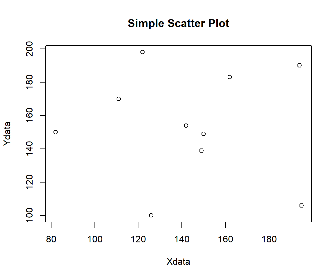
Example 1: Simple Scatter Plot in R
Using a Data Object:
Using the attitude data from the "datasets" package with some sub-setting and filtering.
Sample rows from attitude:
   rating complaints privileges learning raises critical advance
1      43         51         30       39     61       92      45
6      43         55         49       44     54       49      34
10     67         61         45       47     62       80      41
13     69         62         57       42     55       63      25
16     81         90         50       72     60       54      36
17     74         85         64       69     79       79      63
23     53         66         52       50     63       80      37
27     78         75         58       74     80       78      49
29     85         85         71       71     77       74      55
30 82 82 39 59 64 78 39Or:
x = attitude[, "rating"]
y = attitude[, "complaints"]
plot(x, y, pch = 15, main = "Simple Scatter Plot")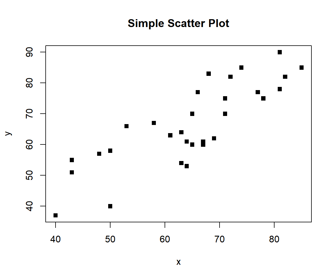
Example 2: Simple Scatter Plot in R
2 Create Scatter Plot with Regression Line and Lowess Fit in R
To make a scatter plot with regression line and lowess fit, use the
abline() and lines() functions respectively.
For the "f" argument in lowess() function, the higher the
value, the smoother the line. See line types & widths and adding lines to
plots.
x = attitude$privileges
y = attitude$learning
plot(x, y)
abline(lm(y ~ x), col = "blue")
lines(lowess(x, y, f = 0.5), col = "red", lty = "dashed")
lines(lowess(x, y, f = 2), col = "green", lty = "dashed")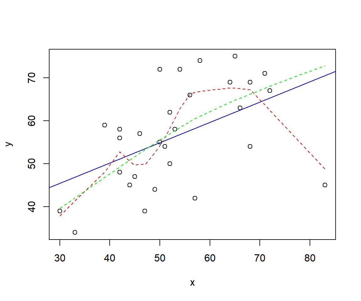
Scatter Plot with Regression Line and Lowess Fit in R
3 Set Title, Labels, Limits, Colors, Dot Type, Fonts of a Scatter Plot in R
Here we set details such as title (main), x-axis and y-axis labels (xlab, ylab), limits (xlim, ylim), colors (col), dot type (pch), font types (font), and font sizes (cex). See also setting colors and fonts for more details.
x = attitude$raises
y = attitude$rating
plot(x, y,
     main = "Ratings vs Raises",
     xlab = "Raises", ylab = "Ratings",
     xlim = c(min(x), max(x)),
     ylim = c(min(y), max(y)),
     col = "purple",
     col.main="blue", col.lab="green", col.axis="gold",
     pch = 3,
     font=3, font.lab=2, font.main=4,
     cex.main=2, cex.lab=1.25, cex.axis=1.25)

# Add lines

abline(lm(y ~ x), col = "blue")
lines(lowess(x, y, f = 0.5), col = "green", lty = "dashed", lwd =2)
lines(lowess(x, y, f = 2), col = "red", lty = "dotted", lwd = 4)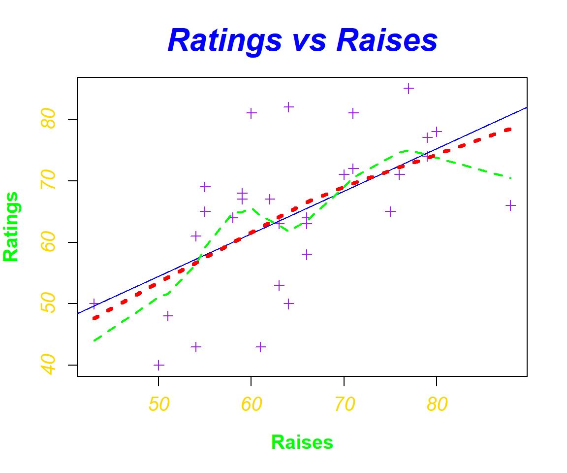
Scatter Plot with Title, Labels, Limits, Colors, Dot Type, Fonts Set in R
4 Multiple Scatter Plots Overlay with Different Colors by Variables in R
To have multiple scatter plots overlaid in one plot, use the
points() function. You can add details to the scatter plot
and the points as in the example above. You should also adjust the axes
limits if necessary to include the extra points added to the plot.
Rtg = attitude$rating
Cmp = attitude$complaints
Rai = attitude$raises
Crt = attitude$critical

plot(Cmp, Rtg, col = "green")
points(Rai, Rtg, col = "blue", cex = 1.5)
points(Crt, Rtg, col = "red", cex = 2.5)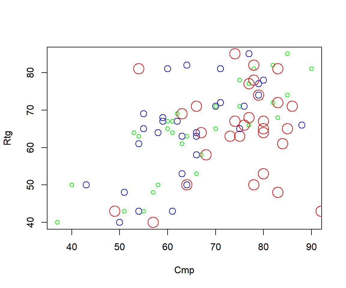
Multiple Scatter Plots Overlay with Different Colors by Variables in R
Adjust the axes limits to accommodate for the limits of the new points added.
plot(Cmp, Rtg,
     xlim = range(c(Rtg, Cmp, Rai, Crt)),
     ylim = range(c(Rtg, Cmp, Rai, Crt)),
     col = "green")
points(Rai, Rtg, col = "blue", cex = 1.5)
points(Crt, Rtg, col = "red", cex = 2.5)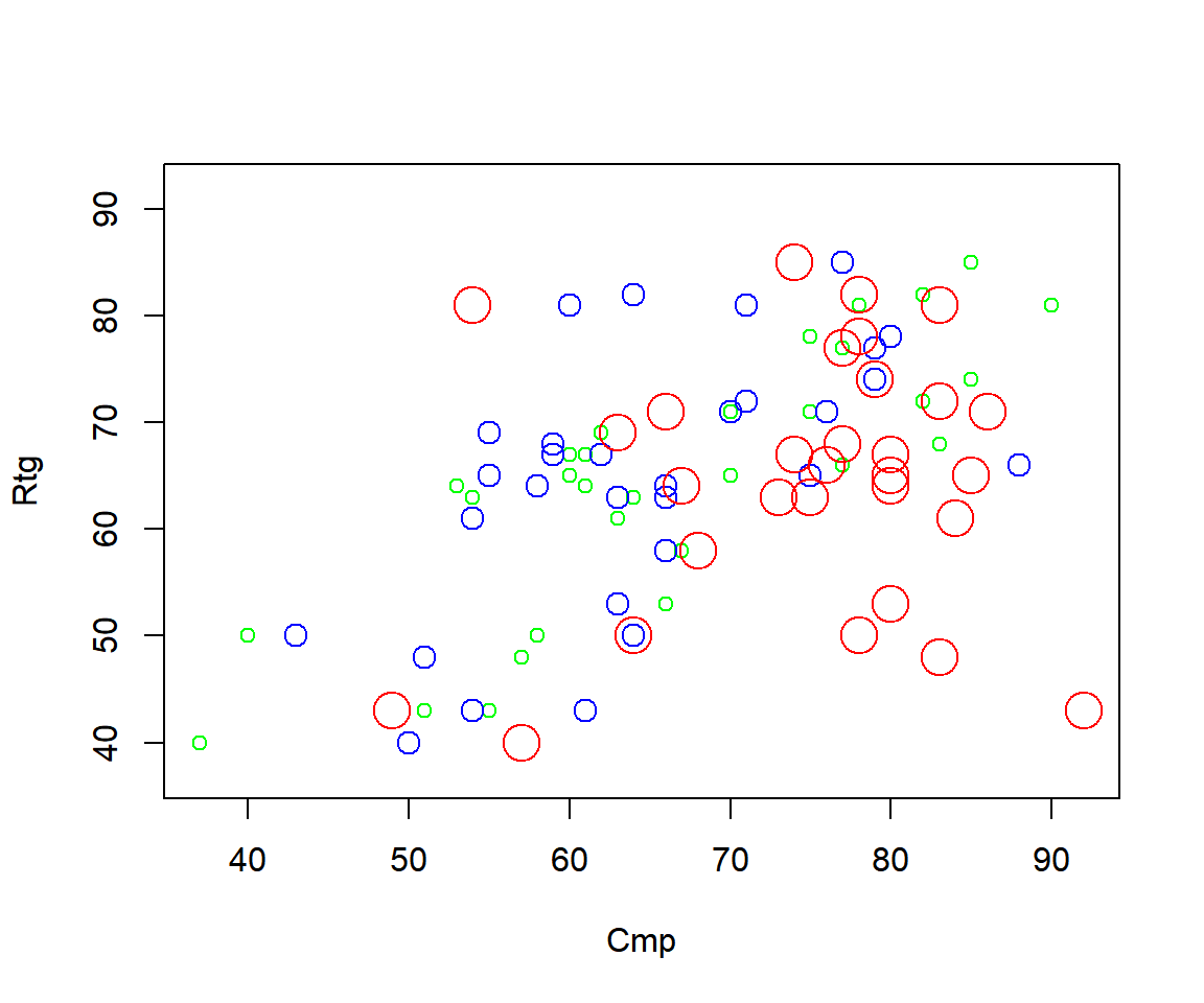
Multiple Scatter Plots Overlay in One Plot (Limits Adjusted) in R
5 Multiple Variables Scatter Plot Side-by-side in One Plot in R
To have multiple variables scatter plots side-by-side in one plot,
use the par() function. The first argument is the number of
rows, while the second is the number of columns. Then make your scatter
plots, and they will be added one after the other. You can add details
to each scatter plot as in the examples above. See also multiple plots on the same
graph for more details.
For example, for 2 rows and 3 columns use:
par(mfrow=c(2,3))
plot(attitude$rating, attitude$complaints)
plot(attitude$rating, attitude$privileges)
plot(attitude$rating, attitude$learning)
plot(attitude$rating, attitude$raises)
plot(attitude$rating, attitude$critical)
plot(attitude$rating, attitude$advance)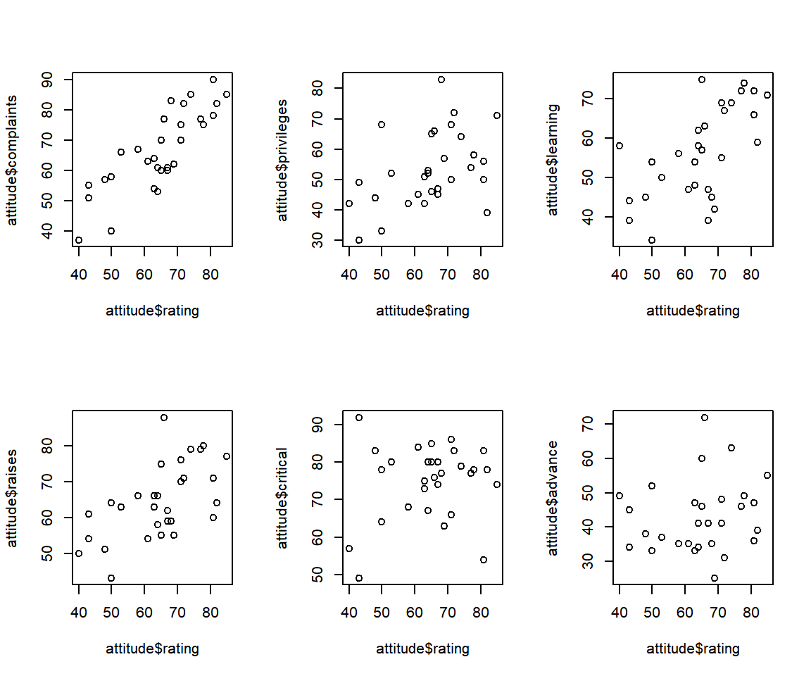
Multiple Variables Scatter Plots Side-by-side in One Plot in R
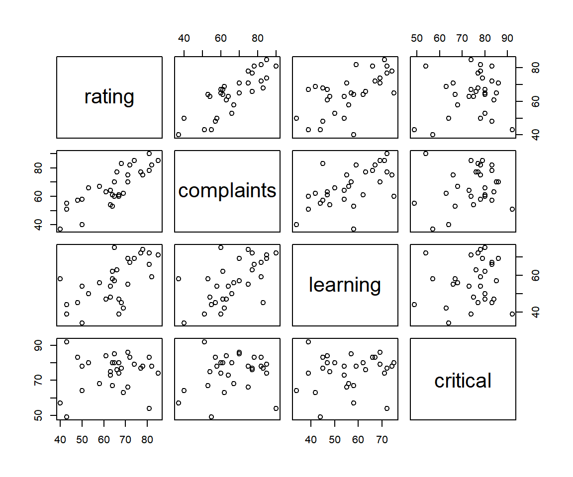
For scatter plot of each column vs the others:
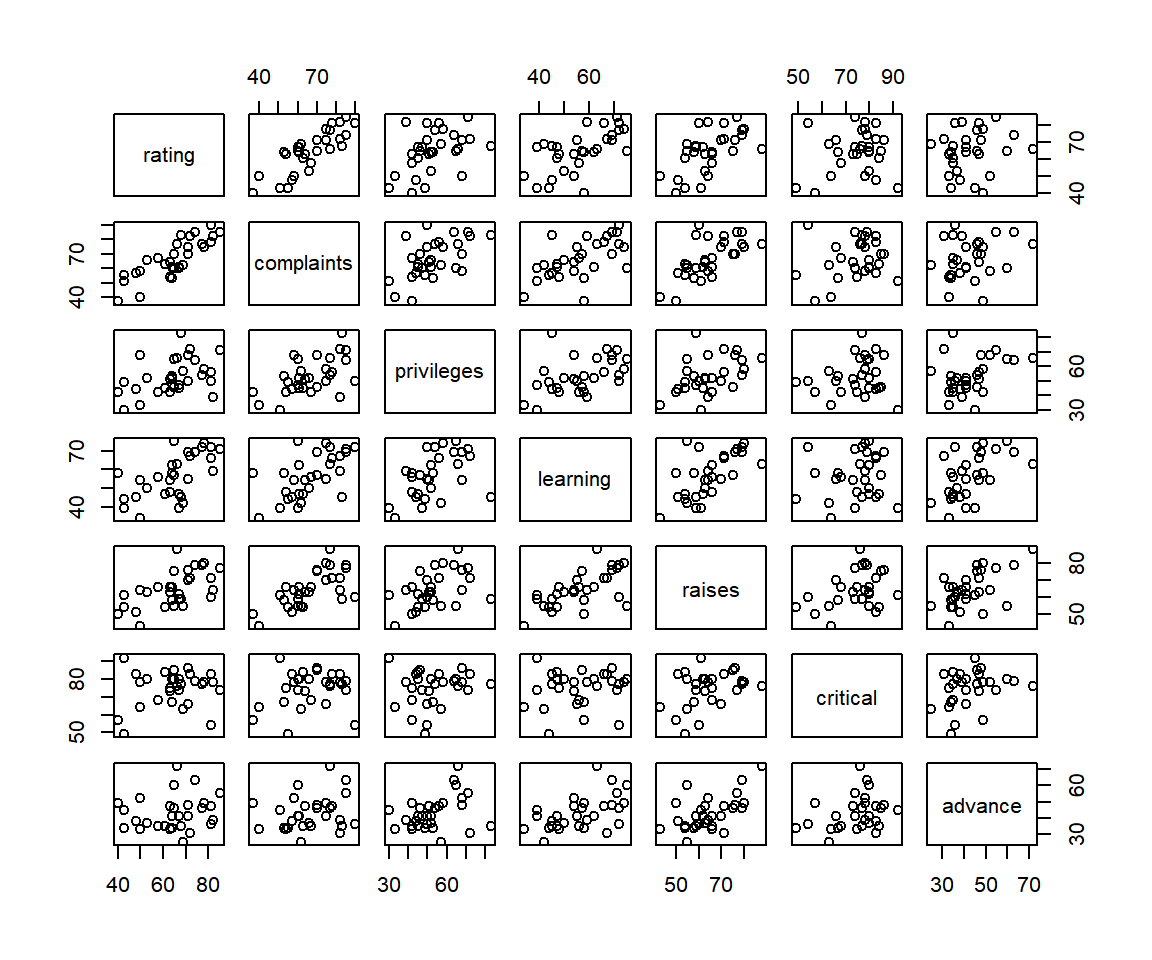
Multiple Variables Scatter Plots in One Plot (Each vs Others) in R
For a subset of the dataframe selecting some of the columns and excluding the others:
Multiple Variables Scatter Plots Side-by-side in One Plot (Select Columns) in R
The feedback form is a Google form but it does not collect any personal information.
Please click on the link below to go to the Google form.
Thank You!
Go to Feedback Form
Copyright © 2020 - 2026. All Rights Reserved by Stats Codes