Plots and Charts in R
Here we introduce plots & charts in R, with a table of several plots & charts, and pages on graphical parameters and plot designs.
1 Table of Various Plots & Charts in R
The following are examples of some plot & charts in R, with more details in the linked pages on them.
| Type | Example |
|---|---|
| Histogram |
Histdata = c(164, 152, 144, 128, 146, 194, 84, 196, 113, 124)hist(Histdata, main = "Histogram")
|
| Density Plots |
Densitydata = c(552, 645, 55, 641, 662, 188, 87, 198, 223, 588)den = density(Densitydata)plot(den, main = "Density Histogram")
|
| Scatter Plots |
Xdata = c(164, 153, 144, 127, 147, 194, 86, 191, 113, 123)Ydata = c(184, 147, 159, 102, 136, 108, 153, 191, 172, 197)plot(Xdata, Ydata, main = "Scatter Plot")
|
|
Bar Charts/ Bar Plots |
Q1 = c(96.7, 129.3, 199.5, 159.4, 103.4)Year = c("1992", "1993", "1994", "1995", "1996")barplot(Q1 ~ Year, main = "Bar Plot")
|
| Box Plots |
Boxdata = c(27, 31, 55, 24, 72, 53, 54, 27, 68, 19)boxplot(Boxdata, main = "Box Plot")
|
| Line Charts |
Linedata = c(151, 142, 147, 122, 145, 198, 84, 190, 121, 132)plot(Linedata, type = "l", main = "Line Chart")
|
| Pie Charts |
Grade = c(Year1 = 117, Year2 = 112, Year3 = 201, Year4 = 280)pie(Grade, main = "Pie Chart")
|
| Stem-and-Leaf |
Stemdata = c(76, 77, 73, 65, 54, 68, 63, 54, 66, 64,73, 67, 68, 60, 56, 67, 64, 54, 69, 63)stem(Stemdata)
|
| Plotting Curves |
equation = function(x){4*x^2 - x + 3}curve(equation, -3, 6, main = "Plot of Curve")plot(equation, -3, 6, main = "Plot of Curve")
|
| Dot Plots |
Food = c(24.3, 45.3, 57.4, 72.4, 85.6)Books = c(9.7, 12.4, 28.0, 37.2, 45.3)Expense = as.matrix(cbind(Food, Books))rownames(Expense) = c("1970", "1975", "1980", "1985", "1990")dotchart(Expense, main = "Dot Plot")
|
2 Pages on Graphical Parameters & Plot Designs in R
For details on applying graphical parameters, see the following pages:
For colors.
For legends on plots.
For texts on plots.
Examples of Common Graphical Parameters for Colors and Fonts:
| Region | Text | Font Size | Font Type | Color |
| General | for no plot: type = "n" | cex | font | col |
| Main | main | cex.main | font.main | col.main |
| Labels | xlab & ylab | cex.lab | font.lab | col.lab |
| Axis | limits: xlim & ylim no axis: xaxt = "n", yaxt = "n" |
cex.axis | font.axis | col.axis |
| Sub-titles | sub | cex.sub | font.sub | col.sub |
| Border | border | |||
| Background | bg | |||
| Foreground | fg |
Illustration Using a Histogram:
histdata = rnorm(1000)
hist(histdata,
     main = "Graphical Parameters Plots & Charts Example",
     xlab = "X Label Text",
     ylab = "Y Label Text",
     sub = "The Plot Sub",
     cex = 1, cex.main = 1.2, cex.lab = 1.2,
     cex.axis = 0.7, cex.sub = 0.8,
     font = 1, font.main = 2, font.lab = 3,
     font.axis = 4, font.sub = 2,
     col = "turquoise", col.main = "brown",
     col.lab = "cyan", col.axis = "gold",
     col.sub = "blue",
     border = "red", bg = "green", fg = "orange")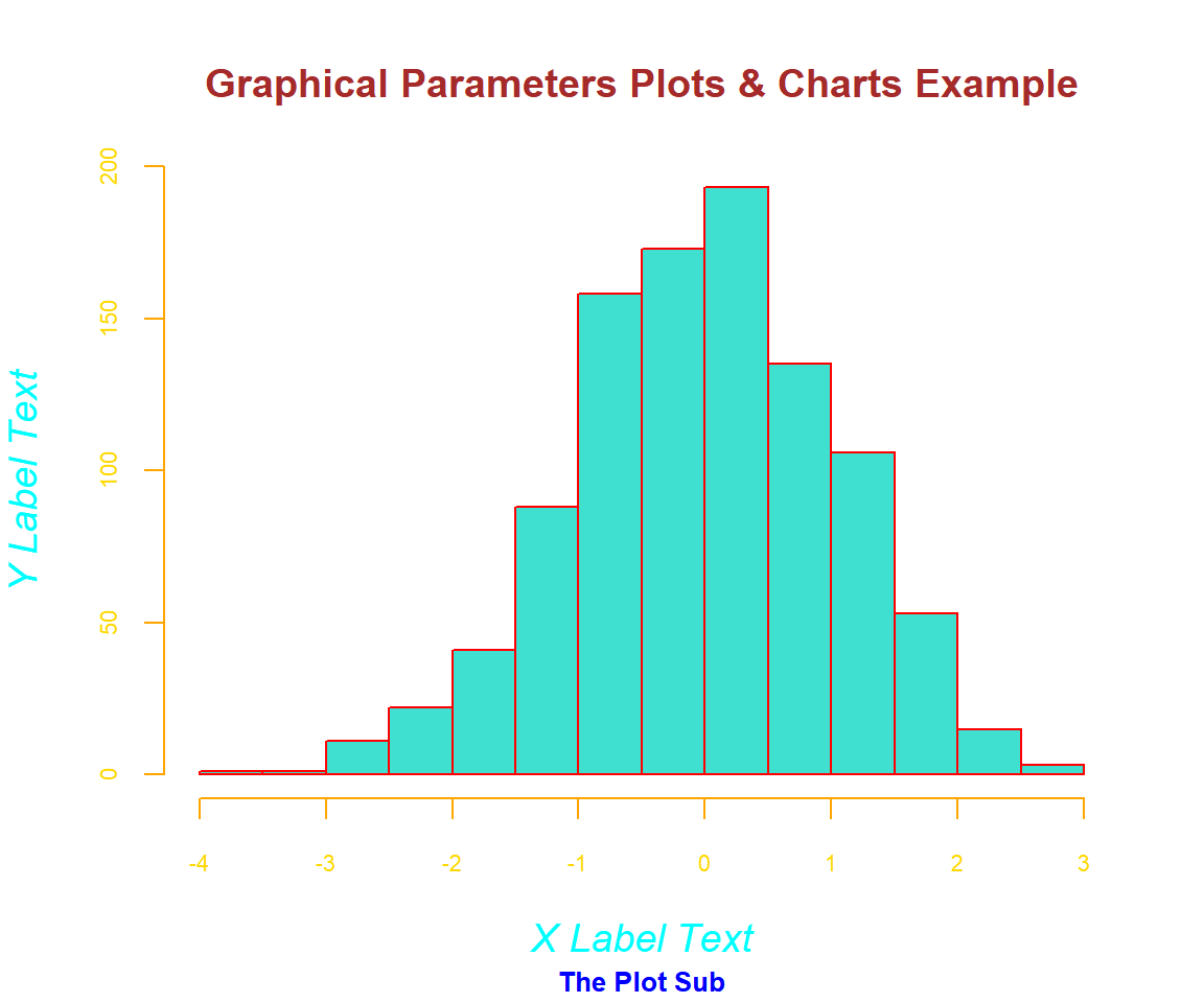
Graphical Parameters Plots & Charts Example in R
The feedback form is a Google form but it does not collect any personal information.
Please click on the link below to go to the Google form.
Thank You!
Go to Feedback Form
Copyright © 2020 - 2026. All Rights Reserved by Stats Codes