Multiple Plots on the Same Graph in R
Here we show how to have multiple plots or charts on one graph in R, including with the same axes and side-by-side.
These will be done using the lines(),
points(), and par() functions from the
"graphics" package.
| Function | Usage |
| lines() | Add lines to a plot |
| points() | Add points to a plot |
| par(mfrow = c(a, b)) | Add plots to graph by row; a rows and b columns |
| par(mfcol = c(a, b)) | Add plots to graph by column; a rows and b columns |
| par(mar = c(x, y, a, b)) | Adjust margins sizes; c(bottom, left, top, right) |
1 Multiple Plots with the Same Axis in R
1.1 Example: Scatter Plots
Here we show how to have multiple scatter plots on one plot with the same axis. We make the first scatter plot, then add points from the second and third scatter plots sequentially using the point() function. You can add as many colored points as needed.
set.seed(123)
v1 = rnorm(20)
v2 = rnorm(20) + rnorm(20)/3
v3 = rnorm(20) + rnorm(20)/4
v3 = rnorm(20) + rnorm(20)/5
v4 = rnorm(20) + rnorm(20)/6

# First points from the first scatter plot
plot(v2, v1,
     xlim = range(c(v1, v2, v3, v4)),
     ylim = range(c(v1, v2, v3, v4)),
     col = "turquoise",
     main = "Multiple Scatter Plots on the Same Graph")

# Add more points
points(v3, v1, col = "red", cex = 1.5, pch = 3)
points(v4, v1, col = "black", cex = 1.2, pch = 4)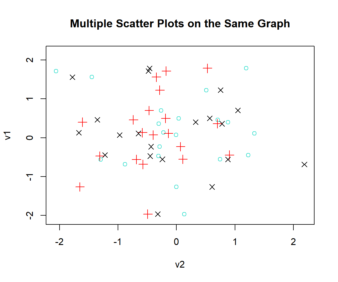
Multiple Plots with the Same Axis in R: Scatter Plots
1.2 Example: Density Plots
Here we show how to have multiple density plots on one plot with the same axis. We make the first density plot, then add lines from the second and third plots using the lines() function. You can add as many lines as needed.
set.seed(123)
v1 = rnorm(50, 5, 1)
d1 = density(v1)
v2 = rnorm(50, 6, 1)
d2 = density(v2)
v3 = rnorm(50, 5.5, 1)
d3 = density(v3)

# First line from the first density plot
plot(d1,
     xlim = range(c(d1$x, d2$x, d3$x)),
     ylim = range(c(d1$y, d2$y, d3$y)),
     col = "blue",
     main = "Multiple Density Plots on the Same Graph")

# Add the second and third lines
lines(d2, col = "red", lty = 3, lwd = 3)
lines(d3, col = "green", lty = 4, lwd = 2.5)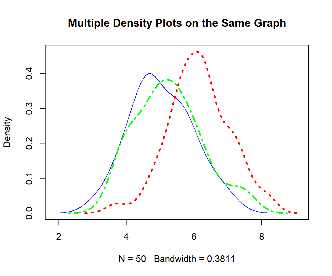
Multiple Plots with Same Axis in R: Density Plots
1.3 Example: Line Charts
Here we show how to have multiple line charts on one plot with the same axis. We make the first line chart, then add a line from the second chart using the lines() function. You can add as many line charts as needed.
See also lines and segments.
set.seed(12)
v1 = rnorm(20, 2, 1)
v2 = rnorm(20, 2.5, 1)

# First line from the first chart
plot(v1, type = "l",
     ylim = range(c(v1, v2)),
     col = "salmon",
     lwd = 2,
     main = "Multiple Line Charts on the Same Graph")

# Add the second line
lines(v2, col = "green", lty = 4, lwd = 3)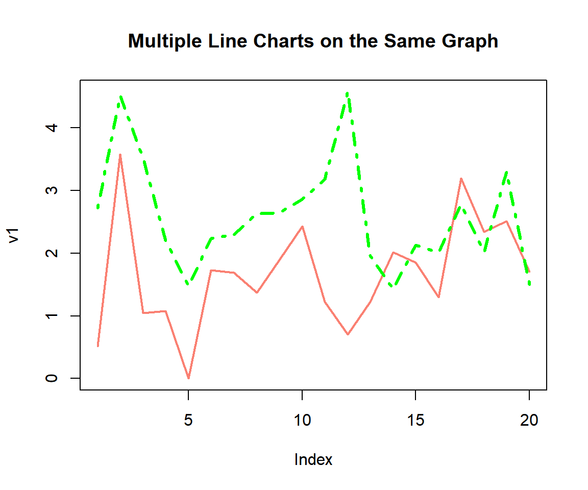
Multiple Plots with the Same Axis in R: Line Charts
1.4 Example: Histograms
Here we show how to have multiple histograms on one plot with the same axis. We have the histograms stacked sharing the same x-axis at the bottom. This histogram plot type example is applicable to other plot types as well.
set.seed(12)
v1 = rnorm(100, 10, 2)
v2 = rnorm(100, 11, 2)
v3 = rnorm(100, 9, 2)

# Set the limits of the x-axis
lower = floor(min(c(v1, v2, v3)))
upper = ceiling(max(c(v1, v2, v3)))

# Set 3 rows and 1 column of histograms
par(mfrow = c(3, 1))

# Make the plots
hist(v1, xaxt = "n", main = "Histogram 1",
     xlim = c(lower, upper))
hist(v2, xaxt = "n", main = "Histogram 2",
     xlim = c(lower, upper))
hist(v3, main = "Histogram 3",
     xlim = c(lower, upper))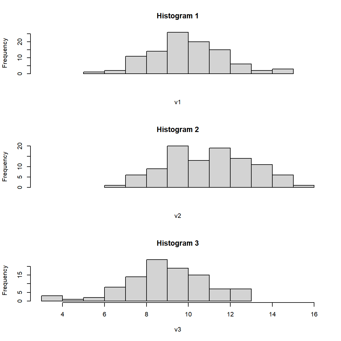
Multiple Plots with the Same Axis in R: Histograms
2 Multiple Plots Side-by-side by Rows in R
Here we show how to have multiple plots side-by-side by rows. Use the
par(mfrow = c(a, b)) function to add plots side-by-side by
a rows.
# Set 2 rows and 3 columns of plots
par(mfrow = c(2, 3))

# Add the plots
hist(rnorm(200, 5, 1), main = "Plot 1")
plot(rexp(200), type = "l", main = "Plot 2")
boxplot(rnorm(200) ~ rep(c("Grp1", "Grp2"), each = 100), main = "Plot 3")
plot(rnorm(100), rnorm(100), main = "Plot 4")
plot(density(rexp(200)), main = "Plot 5")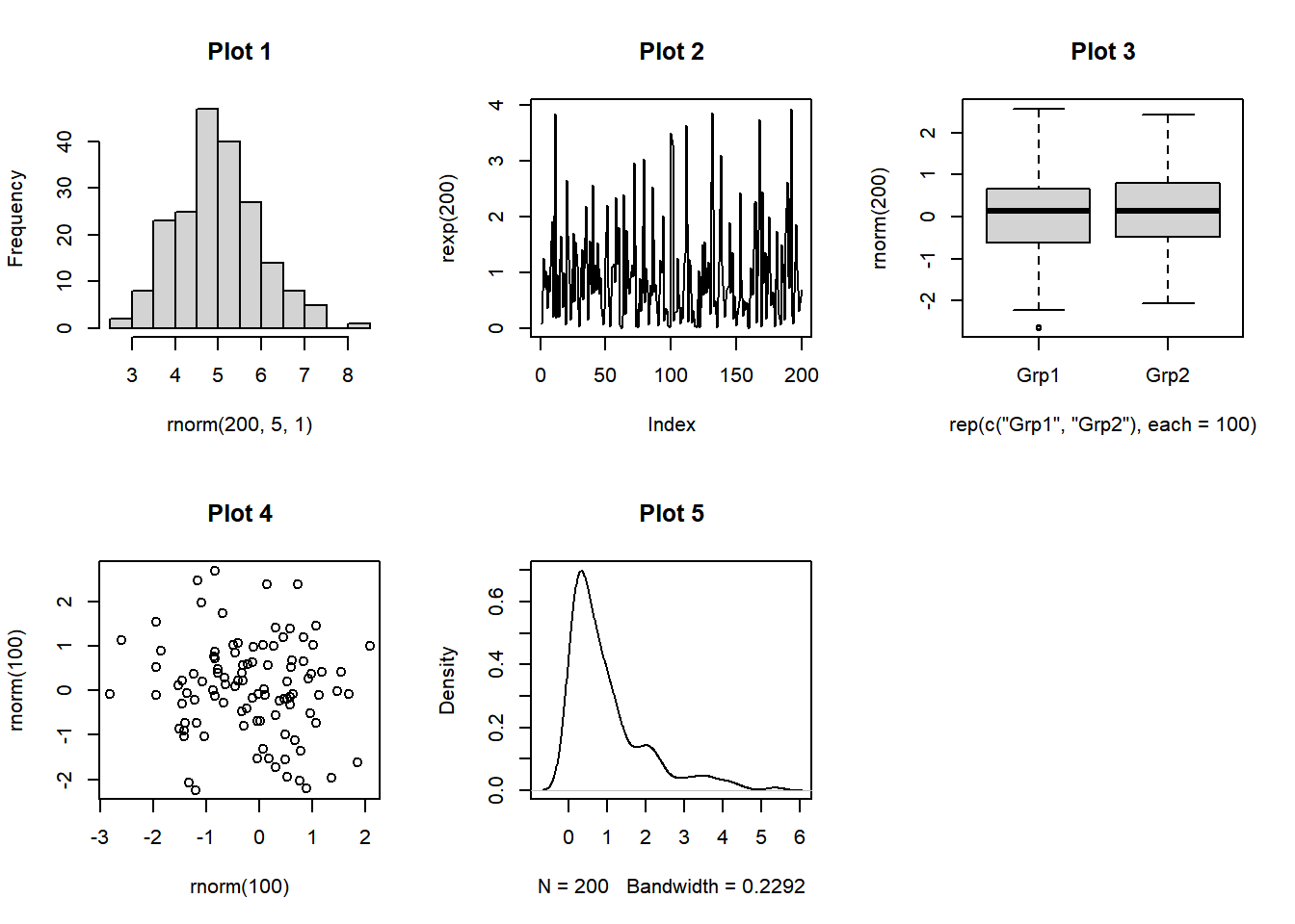
Multiple Plots Side-by-side by Rows in R
3 Multiple Plots Side-by-side by Columns in R
Here we show how to have multiple plots side-by-side by columns. Use
the par(mfcol = c(a, b)) function to add plots side-by-side
by b columns.
# Set 3 rows and 2 columns of plots
par(mfcol = c(3, 2))

# Add the plots
hist(rnorm(200, 5, 1), main = "Plot 1")
plot(rexp(200), type = "l", main = "Plot 2")
boxplot(rnorm(200) ~ rep(c("Grp1", "Grp2"), each = 100), main = "Plot 3")
plot(rnorm(100), rnorm(100), main = "Plot 4")
plot(density(rexp(200)), main = "Plot 5")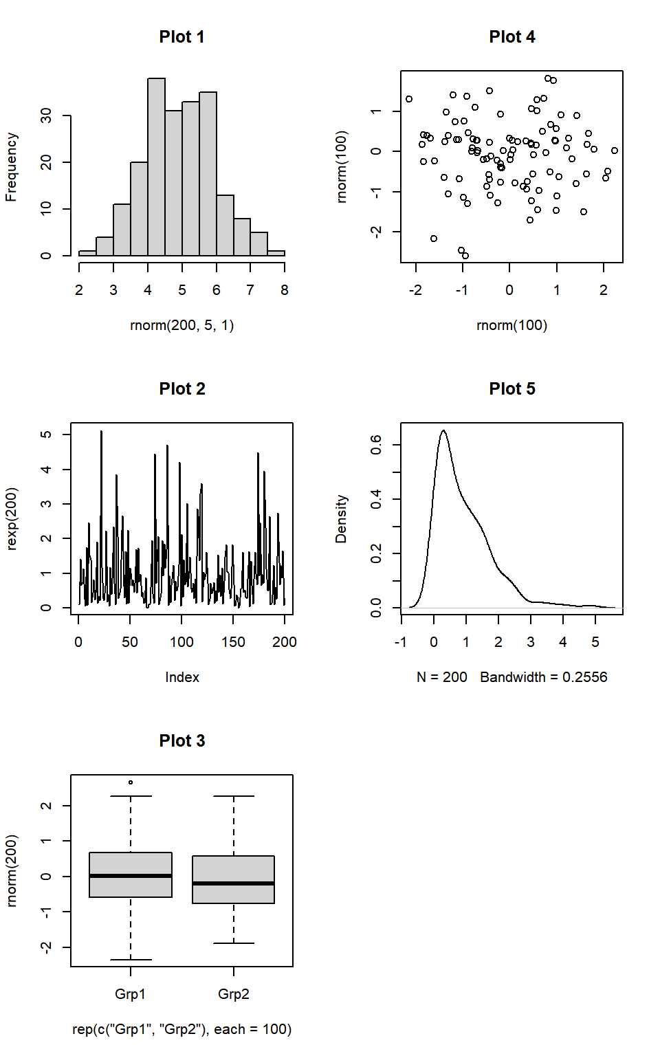
Multiple Plots Side-by-side by Columns in R
4 Multiple Plots Side-by-side with Margins Adjusted in R
Here we show how to adjust the margins of multiple plots and bring
them closer to each. Use the
par(mar = c(bottom, left, top, right)) function to adjust
the margins. The default is c(bottom, left, top, right) = c(5, 4, 4, 2).
Here we use c(2, 4, 4, 2), changing the bottom from 5 to 2. This removes
the x-axis labels and brings the plots closer together.
# Set 2 rows and 3 columns of plots
par(mfrow = c(2, 3))

# Adjust margins to bring the plots closer
par(mar = c(2, 4, 4, 2))

# Add the plots
plot(rnorm(100), rnorm(100), main = "Plot 1")
plot(density(rexp(200)), main = "Plot 2")
hist(rnorm(200, 5, 1), main = "Plot 3")
boxplot(rnorm(200) ~ rep(c("Grp1", "Grp2"), each = 100), main = "Plot 4")
plot(rexp(200), type = "l", main = "Plot 5")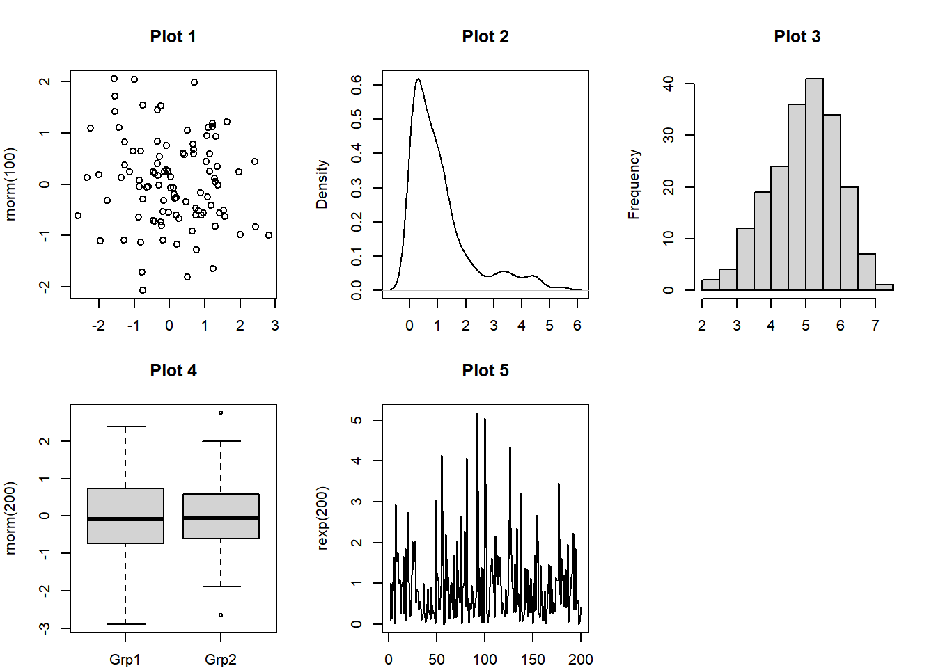
Multiple Plots Side-by-side with Margins Adjusted in R
The feedback form is a Google form but it does not collect any personal information.
Please click on the link below to go to the Google form.
Thank You!
Go to Feedback Form
Copyright © 2020 - 2026. All Rights Reserved by Stats Codes