Density Plots in R
Here, we show how to make single or multiple density plots in R, and set title, labels, limits, colors, line types & widths, and fonts.
These are done with the density(), plot()
and lines() functions.
See plots & charts and line types & widths for graphical parameters and other plots and charts.
1 Create a Simple Density Plot in R
Enter the data by hand:
Densitydata = c(562, 650, 42, 626, 649, 195,  82, 194, 211, 622)
den = density(Densitydata)
plot(den, main = "Simple Density Plot")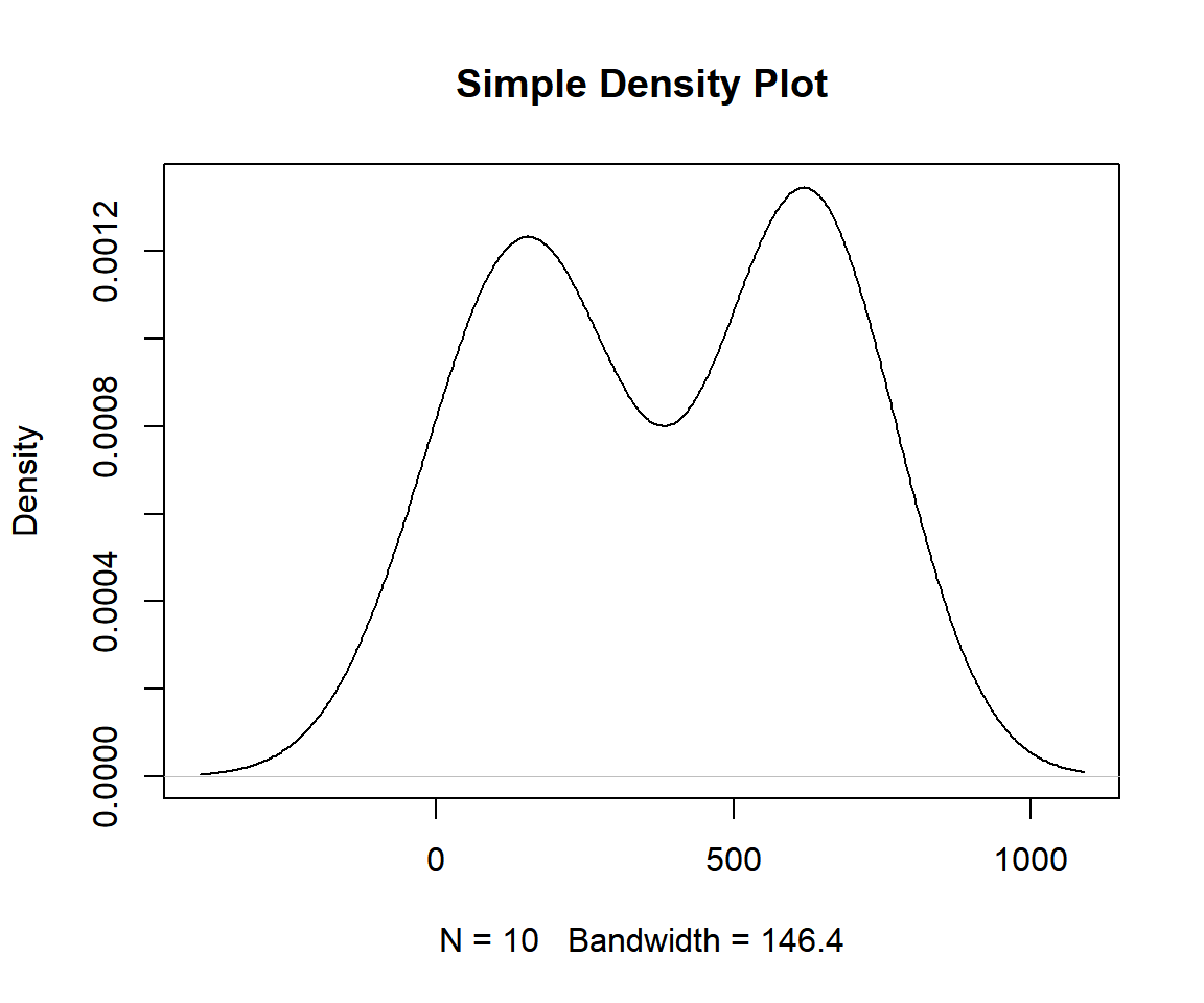
Example 1: Simple Density Plot in R
Using a Data Object:
Using the quakes data from the "datasets" package with some sub-setting and filtering.
Sample rows from quakes:
        lat   long depth mag stations
1    -20.42 181.62   562 4.8       41
70   -15.46 187.81    40 5.5       91
175  -15.03 182.29   399 4.1       10
248  -15.50 186.90    46 4.7       18
337  -25.80 182.10    68 4.5       26
347  -27.60 182.40    61 4.6       11
451  -26.46 182.50   184 4.3       11
454  -23.19 182.80   237 4.3       18
860  -13.16 167.24   278 4.3       17
1000 -21.59 170.56 165 6.0 119Or:
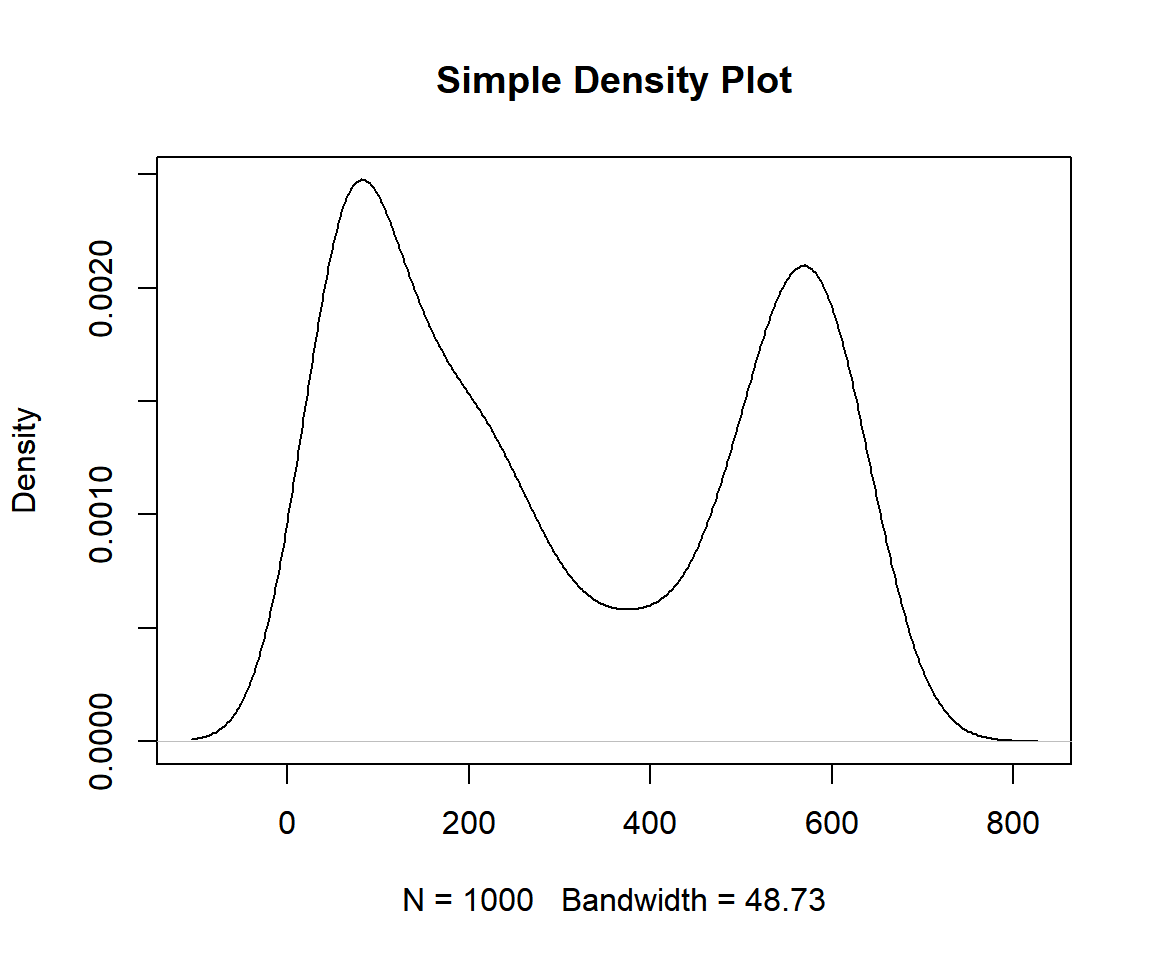
Example 2: Simple Density Plot in R
2 Adjust the Smoothness or Bandwidth of Density Plot in R
To adjust the smoothness or bandwidth of the plot, specify the "bw"
argument in the density() function. The higher the
bandwidth value, the smoother the plot.
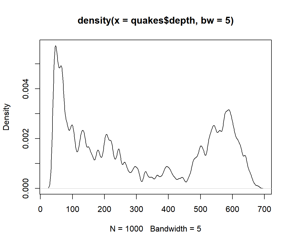
Example 1: Density Plot with Bandwidth Set in R
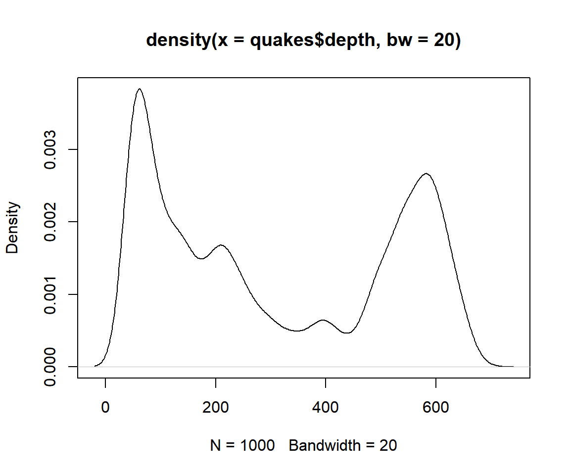
Example 2: Density Plot with Bandwidth Set in R
3 Multiple Density Plots Overlay in R
Using two subsets from the quakes data:
Specify the two (or multiple) kernel densities, then plot the first one and overlay it with the second one on it using the lines() function. It is also important to set the axes limits to accommodate the minimum and maximum \(x\) and \(y\) values for both densities (or multiple).
den1 = density(data1)
den2 = density(data2)
plot(den1,
     xlim = range(c(den1$x, den2$x)),
     ylim = range(c(den1$y, den2$y)),
     col = "red")
lines(den2, col = "green")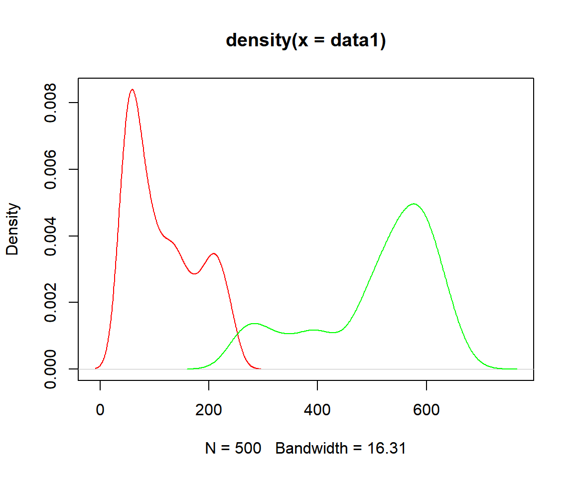
Two Density Plots Overlay in R
4 Set Title, Labels, Limits, Colors, Line Type & Widths, Fonts of a Density Plot in R
Here we set details such as title (main), x-axis and y-axis labels (xlab, ylab), limits (xlim, ylim), colors (col), line types (lty), line widths (lwd), font types (font), and font sizes (cex). See also setting colors and fonts for more details.
Single Density Plot:
den = density(quakes$depth)
plot(den,
     main = "Density Plot of Depths",
     xlab = "Depths",
     ylab = "Density of Depths",
     xlim = c(min(den$x), max(den$x)),
     ylim = c(min(den$y), max(den$y)),
     col = "blue",
     col.main="tan", col.lab="red", col.axis="gold",
     lty = 3, lwd = 1.5,
     font=4, font.lab=3, font.main=1,
     cex.main=1.8, cex.lab=1.4, cex.axis=1)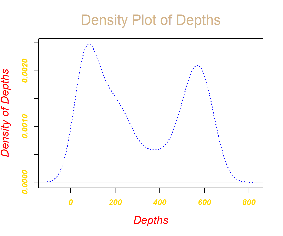
Density Plot with Title, Labels, Limits, Colors, Line Types & Widths, Fonts in R
Overlaid Density Plots:
See data1 and data2 above.
den1 = density(data1)
den2 = density(data2)
plot(den1,
     main = "Density Plot of Depths",
     xlab = "Depths",
     ylab = "Density of Depths",
     xlim = c(min(c(den1$x, den2$x)), max(c(den1$x, den2$x))),
     ylim = c(min(c(den1$y, den2$y)), max(c(den1$y, den2$y))),
     col = "blue",
     col.main="tan", col.lab="yellow", col.axis="green",
     lty = 2, lwd = 1.5,
     font=4, font.lab=3, font.main=1,
     cex.main=1.8, cex.lab=1.4, cex.axis=1)
lines(den2, col = "red", lty = 4, lwd = 1.5)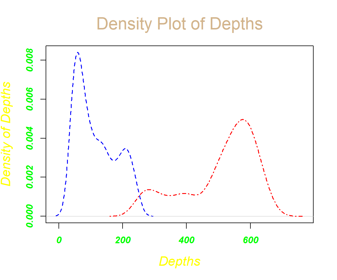
Overlaid Density Plots with Title, Labels, Limits, Colors, Line Types & Widths, Fonts in R
5 Density Plot with Area Under the Curve Filled in R
You can fill up
the area under the curve by using the polygon()
function with the "col" argument specified:
See data1 and data2 above.
den1 = density(data1)
den2 = density(data2)
plot(den1,
     main = "Density Plot of Depths",
     xlab = "Depths",
     ylab = "Density of Depths",
     xlim = c(min(c(den1$x, den2$x)), max(c(den1$x, den2$x))),
     ylim = c(min(c(den1$y, den2$y)), max(c(den1$y, den2$y))),
     col = "yellow",
     lwd = 1.5,
     font=2, font.lab=4, font.main=2, cex.main=1.5, cex.lab=1.2 ,cex.axis=1)
lines(den2, col = "green", lwd = 1.5)

polygon(den1, col = "yellow")
polygon(den2, col = "green")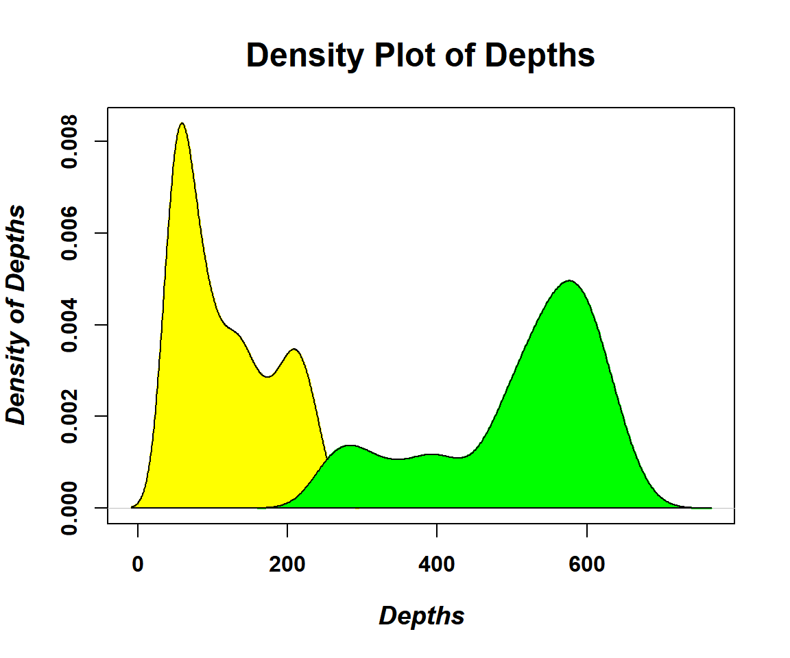
Density Plot with Area Under Curve Filled in R
The feedback form is a Google form but it does not collect any personal information.
Please click on the link below to go to the Google form.
Thank You!
Go to Feedback Form
Copyright © 2020 - 2026. All Rights Reserved by Stats Codes