Bar Charts (Bar Plots) in R
- 1 Create a Simple Bar Chart (Bar Plot) in R
- 2 Create a Horizontal Bar Chart (Bar Plot) in R
- 3 Create Stacked Bar Chart (Bar Plot) with Two or More Variables in R
- 4 Create Grouped or Clustered Bar Chart (Bar Plot) with Two or More Variables in R
- 5 Set Title, Labels, Limits, Colors, Fonts, Legend Shift of a Bar Chart (Bar Plot) in R
- 6 Add Counts on Bars in a Bar Chart (Bar Plot) in R
- 7 Multiple Bar Charts (Bar Plots) in One Plot in R
Here, we show how to make bar charts in R: horizontal, stacked, grouped or clustered bar charts, and set titles, labels, legends, colors, and fonts.
These are done with the barplot() function.
See plots & charts for graphical parameters and other plots and charts.
1 Create a Simple Bar Chart (Bar Plot) in R
Enter the data by hand:
Q1 = c(99.3, 131.3, 200.1, 161.7, 102.5)
Year = c("1982", "1983", "1984", "1985", "1986")
barplot(Q1 ~ Year, main = "Simple Bar Plot")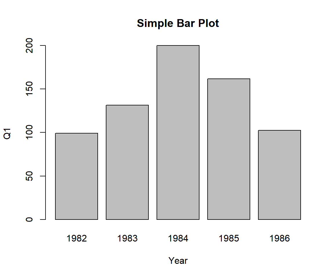
Example 1: Simple Bar Chart (Bar Plot) in R
Using a Data Object:
Using the last 5 years of the UKgas data from the "datasets" package with some sub-setting and filtering.
Gas = matrix(UKgas, nrow = 27)
colnames(Gas) = c("Qtr1", "Qtr2", "Qtr3", "Qtr4")
Gas = cbind(Year = 1982:1986, Gas[23:27,])
Last 5 years from the adjusted UKgas data:
     Year  Qtr1  Qtr2  Qtr3   Qtr4
[1,] 1982  99.3 230.5 827.7  787.6
[2,] 1983 131.3 152.1 467.5 1163.9
[3,] 1984 200.1 336.2 209.7  613.1
[4,] 1985 161.7 371.4 542.7  347.4
[5,] 1986 102.5 240.1 840.5  782.8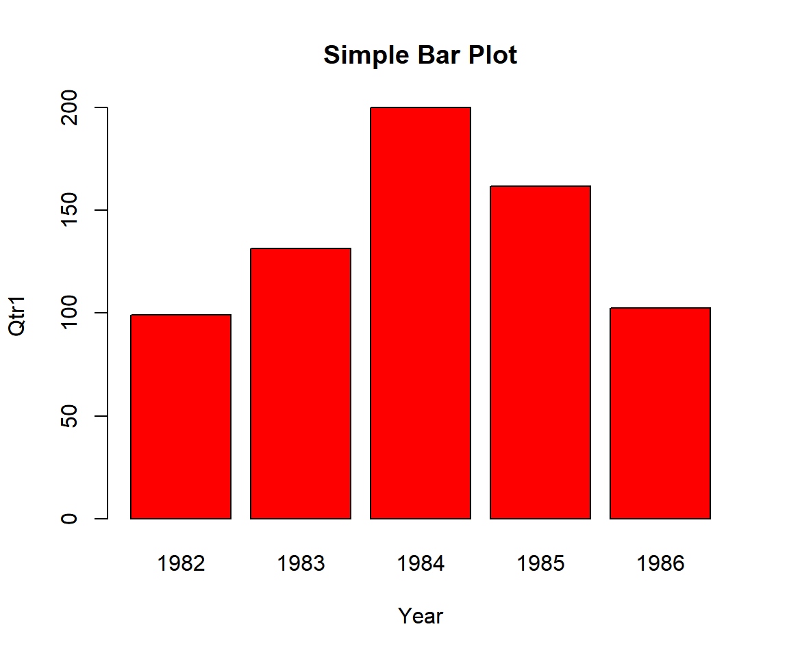
Example 2: Simple Bar Chart (Bar Plot) in R
Or:
Quarter1 = Gas[,"Qtr1"]
Year = Gas[,"Year"]
barplot(Quarter1 ~ Year, col = "Blue",
        main = "Simple Bar Plot")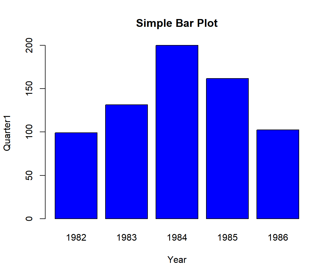
Example 3: Simple Bar Chart (Bar Plot) in R
2 Create a Horizontal Bar Chart (Bar Plot) in R
To create a horizontal bar chart, set the "horiz" argument equal to
TRUE.
See Q1 and Year above.
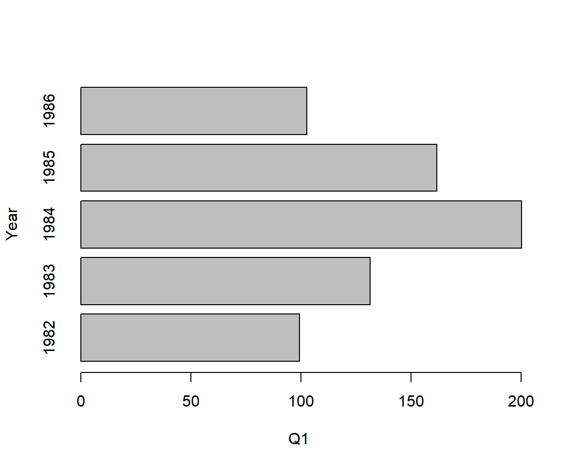
Horizontal Bar Chart (Bar Plot) in R
3 Create Stacked Bar Chart (Bar Plot) with Two or More Variables in R
For multiple variables by one variable (Year in this example):
To make stacked bar charts, bind the columns of interest and plot
them by the variable of interest. Set the "legend" to TRUE
to show the legend. Adjust the
position of the legend with the "arg.legend" argument, setting it as one
of "topleft", "left", "bottomleft", "top", "center", "bottom",
"topright", "right" and "bottomright".
See Gas data above.
# Vertical bars
barplot(cbind(Qtr1, Qtr2, Qtr3) ~ Year, data = Gas,
        legend = TRUE,
        args.legend = list(x = "top"))

# Horizontal bars
barplot(cbind(Qtr1, Qtr2, Qtr3) ~ Year, data = Gas,
        legend = TRUE,
        horiz = TRUE,
        args.legend = list(x = "right"))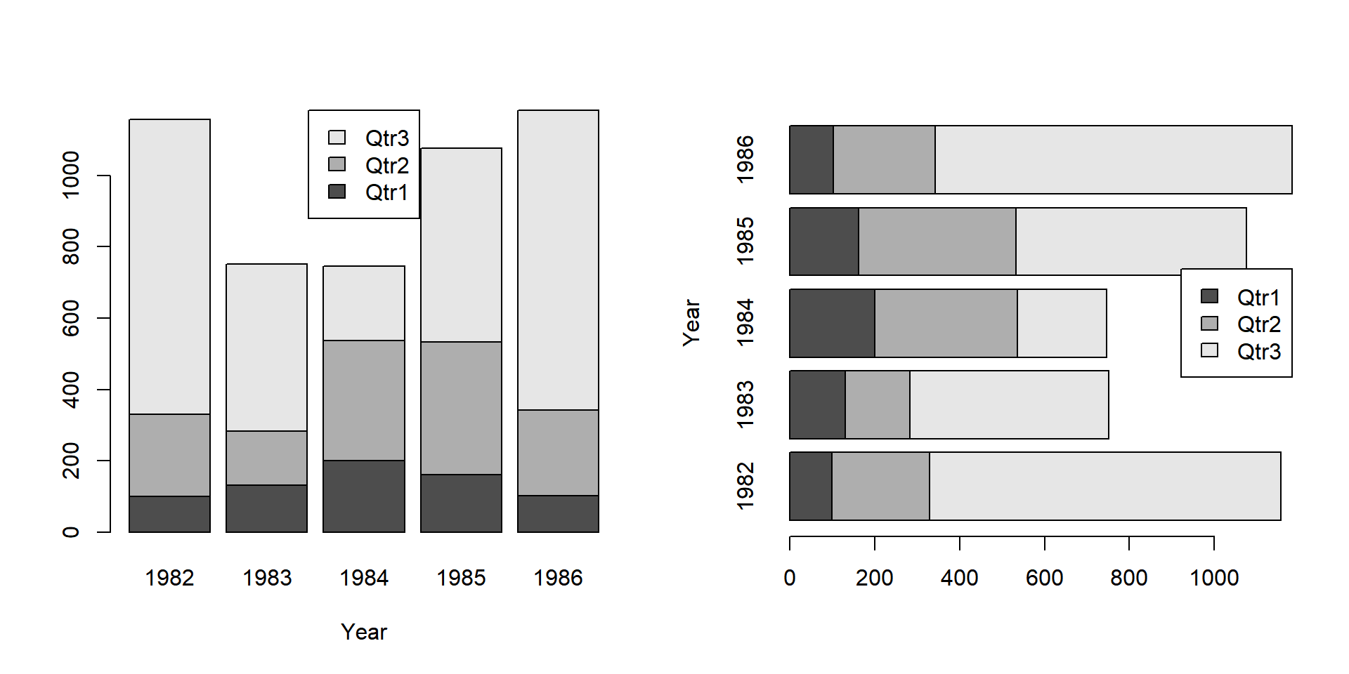
Create Stacked Bar Chart (Bar Plot) with Two or More Variables by One Variable (with Shifted Legend) in R
For one variable by two variables:
Using the UCBAdmissions data from the "datasets" package with some sub-setting and filtering.
UCB = data.frame(UCBAdmissions)
UCB = cbind(UCB[,1:3], School = rep(c("Art", "Science"), each = 12), Freq = UCB[,4])
UCB[,"Dept"]  = rep(LETTERS[1:3], each = 4)
Samples from the adjusted UCBAdmissions data:
      Admit Gender Dept  School Freq
1  Admitted   Male    A     Art  512
5  Admitted   Male    B     Art  353
6  Rejected   Male    B     Art  207
7  Admitted Female    B     Art   17
10 Rejected   Male    C     Art  205
13 Admitted   Male    A Science  138
16 Rejected Female    A Science  244
17 Admitted   Male    B Science   53
22 Rejected   Male    C Science  351
24 Rejected Female    C Science  317
Plot the variable by the two variables of interest. If there are duplicates for the combination of the two variables, subset the other variables in the data as appropriate.
barplot(Freq ~ Dept + School, data = UCB,
        subset = Admit == "Admitted" & Gender == "Male",
        legend = TRUE)
Or:
# Subset data to avoid duplication of variables combination
UCB_data = subset(UCB, Admit == "Admitted" & Gender == "Male")

# Bar Plot
barplot(Freq ~ Dept + School, data = UCB_data,
        legend = TRUE)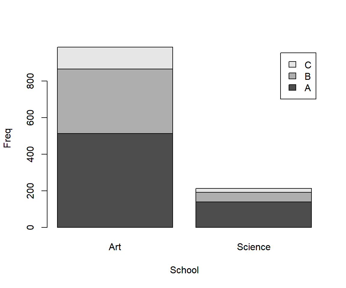
Stacked Bar Chart (Bar Plot) with One Variable by Two Variables in R
4 Create Grouped or Clustered Bar Chart (Bar Plot) with Two or More Variables in R
To make grouped or clustered bar charts, specify the "beside"
argument as TRUE.
For multiple variables by one variable (Year in this example):
See Gas data above.
barplot(cbind(Qtr1, Qtr2, Qtr3, Qtr4) ~ Year, data = Gas,
        legend = TRUE,
        beside = TRUE,
        horiz = TRUE,
        args.legend = list(x = "topright"))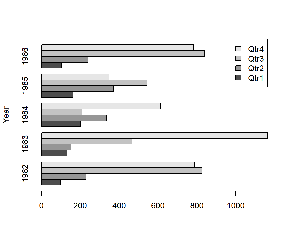
Grouped or Clustered Bar Chart (Bar Plot) - Two or More Variables by One Variable - in R
For one variable by two variables:
See UCB data above.
# Subset data to avoid duplication of variables combination
UCB_data = subset(UCB, Admit == "Admitted" & Gender == "Male")

# Bar Plot
barplot(Freq ~ Dept + School, data = UCB_data,
        beside = TRUE,
        legend = TRUE,
        args.legend = list(x = "top"))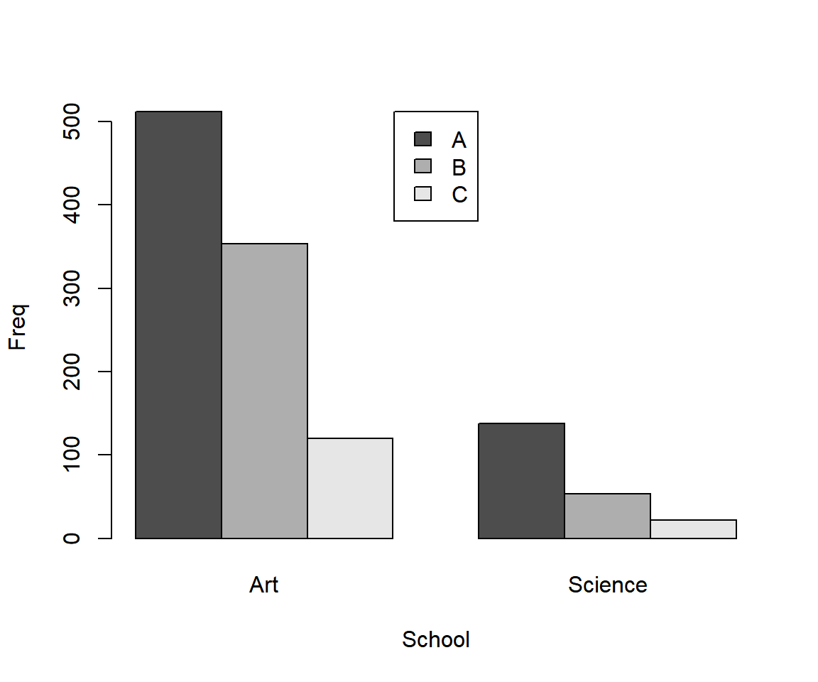
Grouped or Clustered Bar Chart (Bar Plot) - One Variable by Two Variables - in R
5 Set Title, Labels, Limits, Colors, Fonts, Legend Shift of a Bar Chart (Bar Plot) in R
Here we set details such as title (main), x-axis and y-axis labels (xlab, ylab), limits (ylim), colors (col, border), font types (font), and font sizes (cex), legend shift (args.legend). See also setting colors and fonts for more details.
See Gas data above.
barplot(cbind(Qtr1, Qtr2, Qtr3, Qtr4) ~ Year, data = Gas,
        legend = TRUE,
        main = "Gas Consumption in UK",
        xlab = "Year",
        ylab = "in Millions of Therms",
        ylim = c(0, 2500),
        col = c("blue", "green", "yellow", "pink"),
        col.main="green", col.lab="blue", col.axis="red",
        border = "red",
        font=2, font.lab=4, font.main=4,
        cex.main=1.7, cex.lab=1.25, cex.axis=1.2,
        args.legend = list(x = "top"))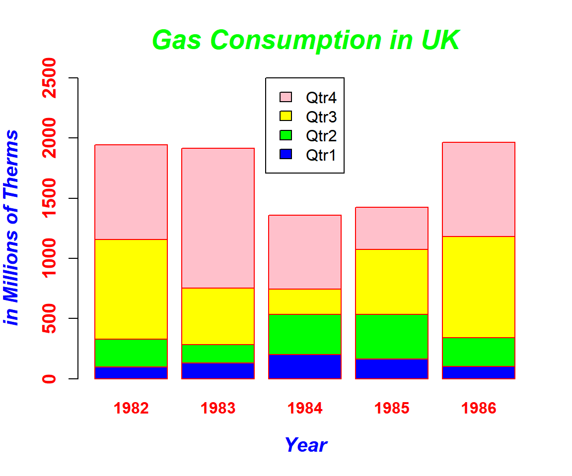
Stacked Bar Chart (Bar Plot) with Title, Labels, Limits, Colors, Fonts Set in R
See UCB data above.
# Subset data to avoid duplication of variables combination
UCB_data = subset(UCB, Admit == "Admitted" & Gender == "Male")

# Bar Plot
barplot(Freq ~ Dept + School, data = UCB_data,
        beside = TRUE,
        legend = TRUE,
        main = "UCB Male Admissions",
        xlab = "School of Choice",
        ylab = "Frequency",
        ylim = c(0, 600),
        col = c("blue", "yellow", "green"),
        col.main="blue", col.lab="red", col.axis="cyan",
        border = "red",
        font=2, font.lab=4, font.main=4,
        cex.main=1.7, cex.lab=1.25, cex.axis=1.2)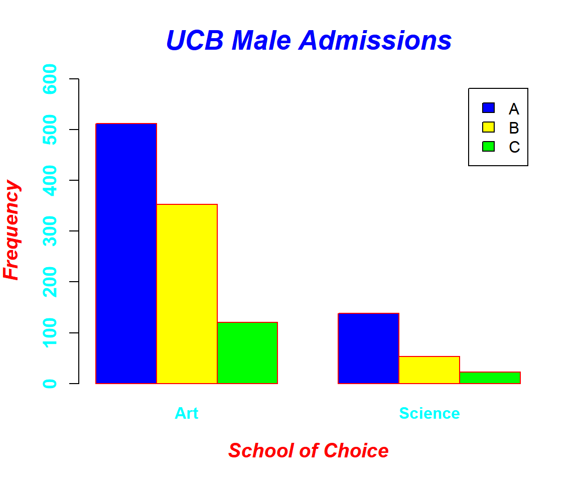
Grouped or Clustered Bar Chart (Bar Plot) with Title, Labels, Limits, Colors, Fonts Set in R
6 Add Counts on Bars in a Bar Chart (Bar Plot) in R
To add counts to bar plot bars
in R, use the text() function. First assign a name to your
bar plot object then add text to the object with the text()
function. The first and second arguments of the text function are the x
and y co-ordinates, while the third are the values to be printed. The
"adj" argument is used to shift the text to a location of choice.
Example for simple bar chart (bar plot):
See Gas data above.
bplot1 = barplot(Qtr1 ~ Year, data = Gas, col = "Red",
                 ylim = c(0, 250))
text(bplot1, Gas[, "Qtr1"], Gas[, "Qtr1"], adj = c(0.5, -0.5), col = "blue")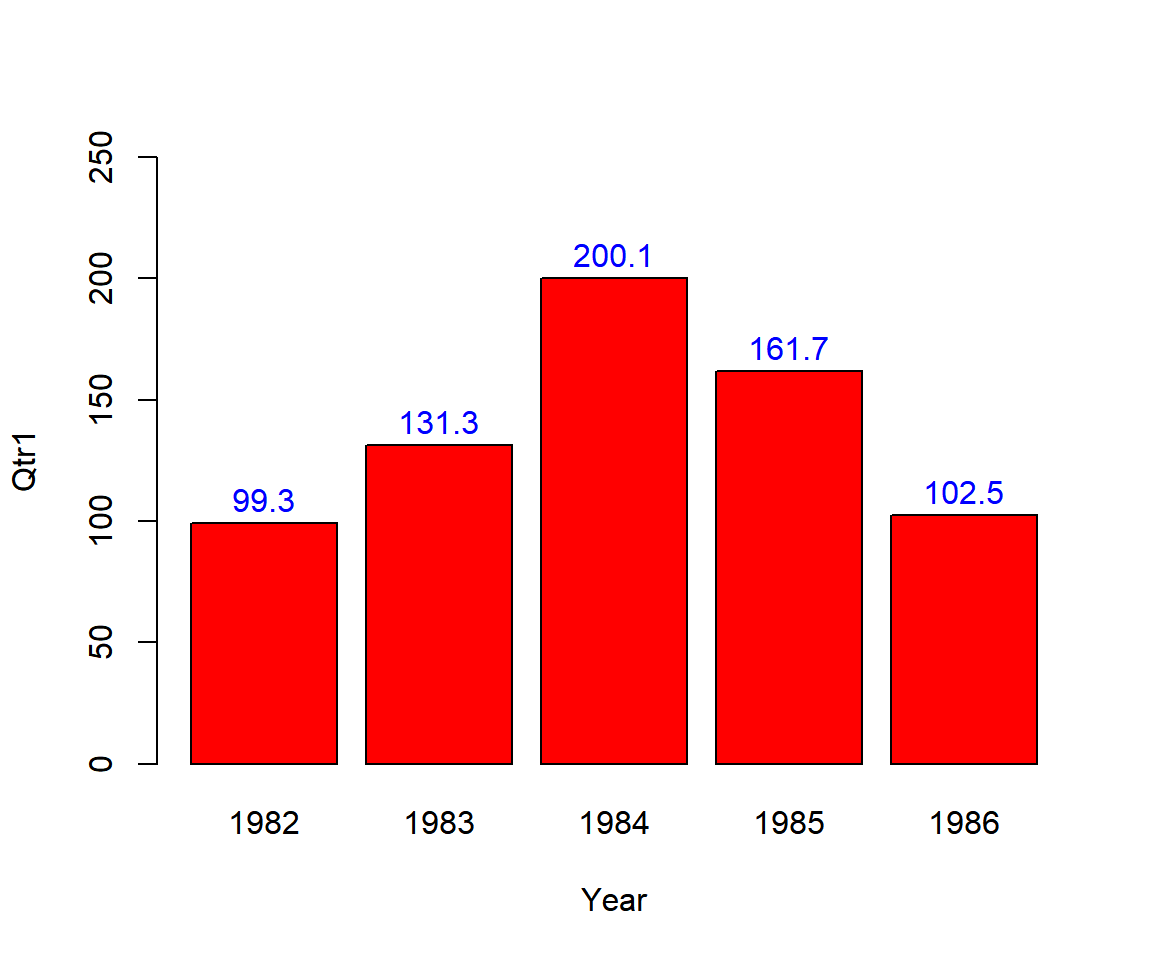
Bar Chart (Bar Plot) with Counts on Bars in R
Example for grouped or clustered bar chart (bar plot):
See UCB data above.
# Subset data to avoid duplication of variables combination
UCB_data = subset(UCB, Admit == "Admitted" & Gender == "Male")

# Bar Plot
bplot2 = barplot(Freq ~ Dept + School, data = UCB_data,
         beside = TRUE,
         legend = TRUE,
         ylim = c(0,600))
UCB_sub = subset(UCB, Admit == "Admitted" & Gender == "Male")
text(bplot2, UCB_data[, "Freq"], UCB_data[, "Freq"], adj = c(0.5, -0.5), col = "blue")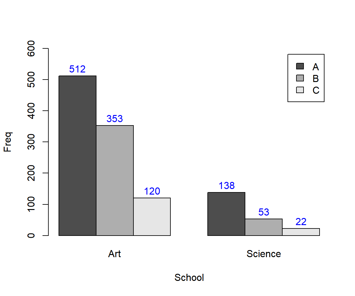
Grouped or Clustered Bar Chart (Bar Plot) with Counts on Bars in R
7 Multiple Bar Charts (Bar Plots) in One Plot in R
To have multiple bar
plots in one plot, use the par() function. The first
argument is the number of rows, while the second is the number of
columns. Then make your bar plots, and they will be added one after the
other. Details can be added to each bar plot as in the examples
above.
For example, for 2 rows and 2 columns use:
See Gas data above.
par(mfrow=c(2,2))
barplot(Qtr1 ~ Year, data = Gas, col = "Blue")
barplot(Qtr2 ~ Year, data = Gas, col = "Red")
barplot(Qtr3 ~ Year, data = Gas, col = "Green")
barplot(Qtr4 ~ Year, data = Gas, col = "Yellow")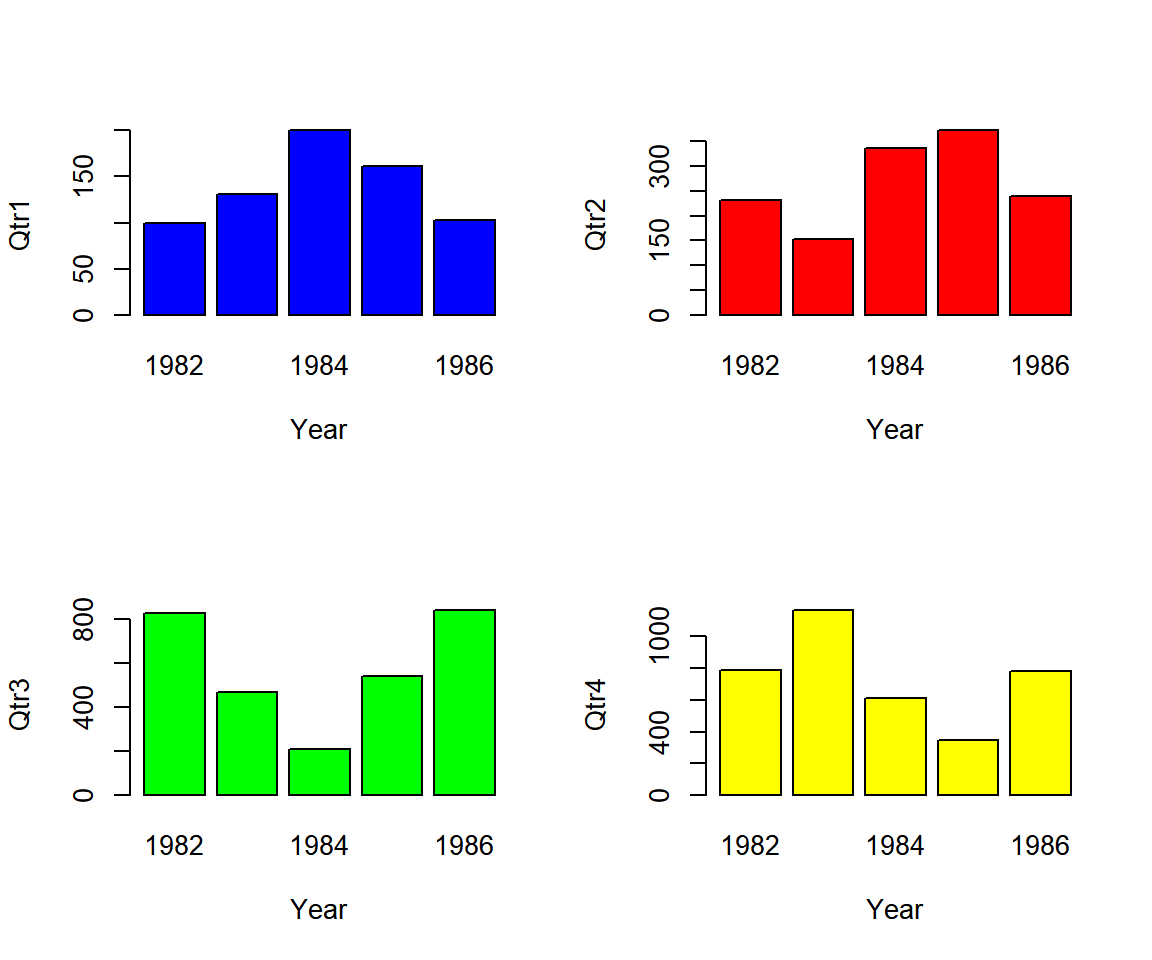
Multiple Bar Charts (Bar Plots) in One Plot in R
The feedback form is a Google form but it does not collect any personal information.
Please click on the link below to go to the Google form.
Thank You!
Go to Feedback Form
Copyright © 2020 - 2026. All Rights Reserved by Stats Codes