Pie Charts in R
Here, we show how to make pie charts in R, and set title, labels, colors, borders, fonts, direction, start angle and legend.
These are done with the pie() function.
See plots & charts for graphical parameters and other plots and charts.
1 Create a Simple Pie Chart in R
Enter the data by hand:
Numbers = c(125, 119, 210, 302)
Grade = c("Freshman", "Sophomore", "Junior", "Senior")
pie(Numbers, labels = Grade, main = "Numbers by Grade")
Or:
Grade = c(Freshman = 125, Sophomore = 119, Junior = 210, Senior = 302)
pie(Grade, main = "Numbers by Grade")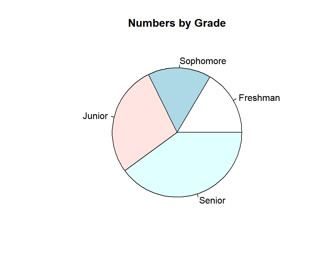
Example 1: Simple Pie Chart in R
Using a Data Object:
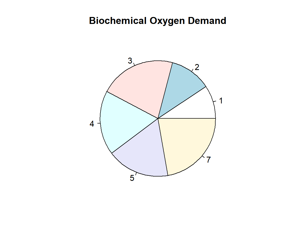
Using the BOD data from the "datasets" package with some sub-setting and filtering.
  Time demand
1    1    8.3
2    2   10.3
3    3   19.0
4    4   16.0
5    5   15.6
6 7 19.8Or:
Example 2: Simple Pie Chart in R
2 Set the Sector Names or Labels in a Pie Chart in R
Specify 6 names or labels for the 6 label categories.
pie(BOD$demand,
    main = "Biochemical Oxygen Demand",
    labels = c("1 Day", "2 Days", "3 Days", "4 Days", "5 Days", "7 Days"))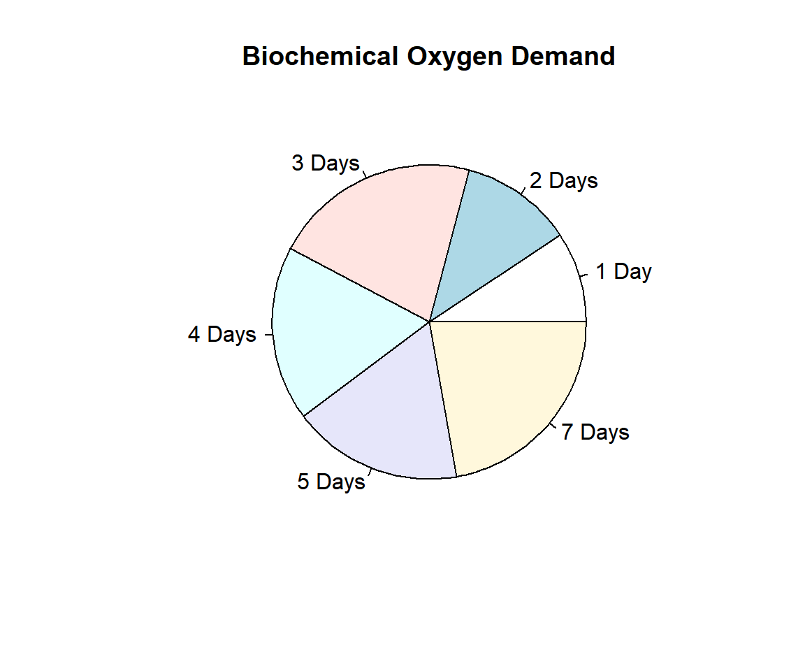
Pie Chart with Sector Names or Labels Set in R
3 Add Percentages to a Pie Chart in R
To add percentages, calculate the percentages and
paste() them to the labels (see vectors).
Numbers = c(125, 119, 210, 302)
Grade = c("Freshman", "Sophomore", "Junior", "Senior")
Percent = Numbers/(sum(Numbers))*100
Percent = round(Percent, 1)
Labels = paste0(Grade, " (", Percent, "%)")
pie(Numbers, labels = Labels, main = "Percentages by Grade")
Or:
Grade = c(Freshman = 125, Sophomore = 119, Junior = 210, Senior = 302)
Percent = Grade/(sum(Grade))*100
Percent = round(Percent, 1)
Labels = paste0(names(Grade), " (", Percent, "%)")
pie(Grade, labels = Labels, main = "Percentages by Grade")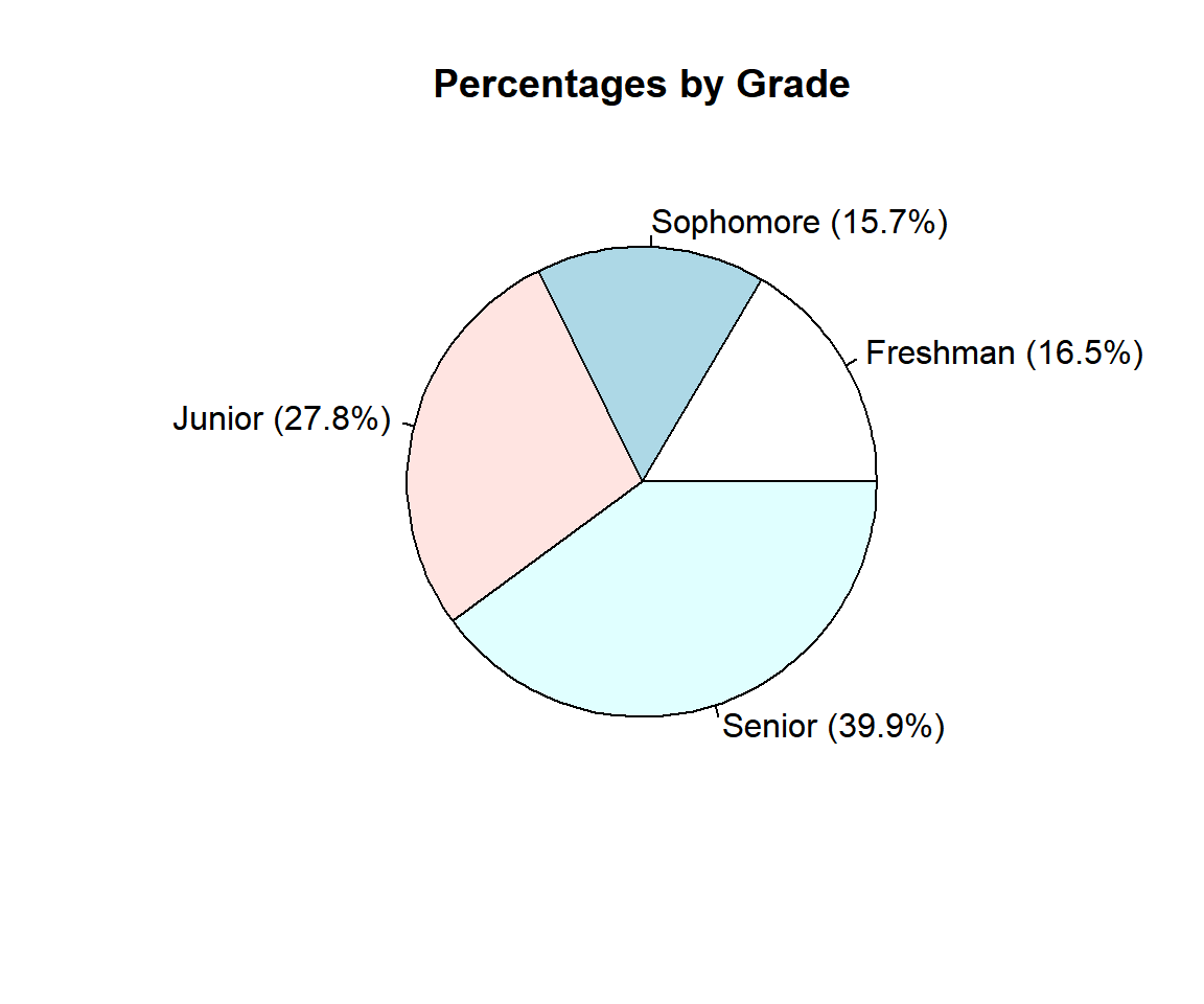
Pie Chart with Percentages in R
4 Set the Colors in a Pie Chart in R
Using the USPersonalExpenditure data from "datasets" package with some sub-setting and filtering. See also colors for more details.
                      1940   1945  1950 1955  1960
Food and Tobacco    22.200 44.500 59.60 73.2 86.80
Household Operation 10.500 15.500 29.00 36.5 46.20
Medical and Health   3.530  5.760  9.71 14.0 21.10
Personal Care        1.040  1.980  2.45  3.4  5.40
Private Education    0.341  0.974  1.80  2.6  3.64
Specify 5 colors for the 5 label categories.
pie(USPersonalExpenditure[,"1960"],
    main = "USPersonalExpenditure in 1960",
    col = c("blue", "pink", "black", "white", "green"))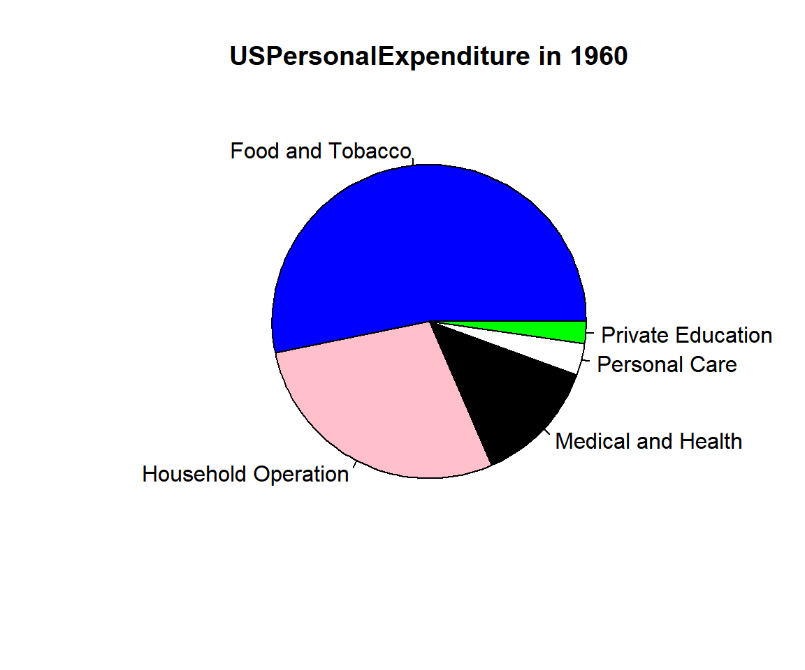
Example 1: Pie Chart with Colors Set in R
Or simply use the rainbow() function color
scheme with 5 as the argument of the function:
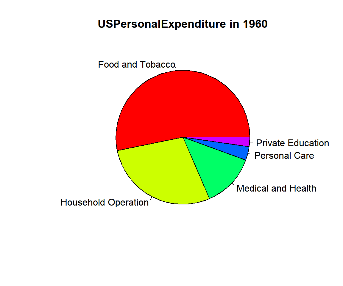
Example 2: Pie Chart with Colors Set in R
Or simply use the gray() function color scheme
with 5 as the argument of the function:
For arguments in seq() (see sequences), 0 means black,
while 1 means white, hence, the lower the choice range the darker the
chart.
pie(USPersonalExpenditure[,"1960"],
    main = "USPersonalExpenditure in 1960",
    col = gray(seq(0.2, 1.0, length = 5)))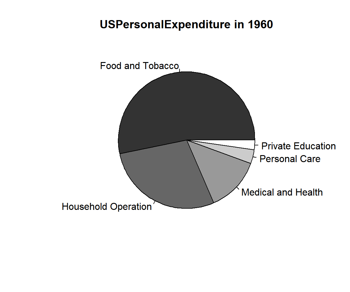
Example 3: Pie Chart with Colors Set in R
5 Pie Chart with Legend in R
To add legend to a pie chart,
use the legend() function. In the legend()
function, the first two arguments are the x-y co-ordinate where the
top-left point of the legend will be located. The center of the pie
chart is (x = 0, y = 0), and values from -1 to 1 are well within the
plot range.
Points = c(Gian = 63, Tara = 89, Jerry = 71, Moore = 102)
Percent = Points/(sum(Points))*100
Percent = round(Percent, 1)
Labels = paste0("(", Percent, "%)")
pie(Points,
    labels = Labels,
    main = "Percentages by Player",
    col = rainbow(4))
legend(1, 0, names(Points), fill = rainbow(4), cex = 0.8)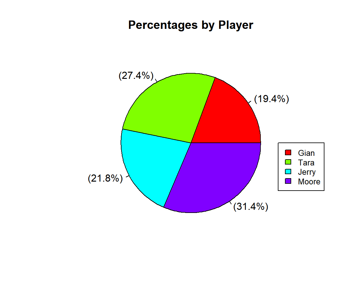
Pie Chart with Legend in R
6 Set Title, Labels, Colors, Fonts, Direction, Start Angle of a Pie Chart in R
Here we set details such as title (main), labels, colors (col, border), font types (font), and font sizes (cex), direction (clockwise), start angle (init.angle). See also setting colors and fonts for more details.
pie(USPersonalExpenditure[,"1960"],
    main = "USPersonalExpenditure in 1960",
    labels = c("Food", "Housing", "Health", "Personal", "Education"),
    col = rainbow(5),
    col.main = "blue",
    border = "white",
    font=3, font.main=4,
    cex.main=1.5, cex=1.2,
    clockwise = TRUE,
    init.angle = 180)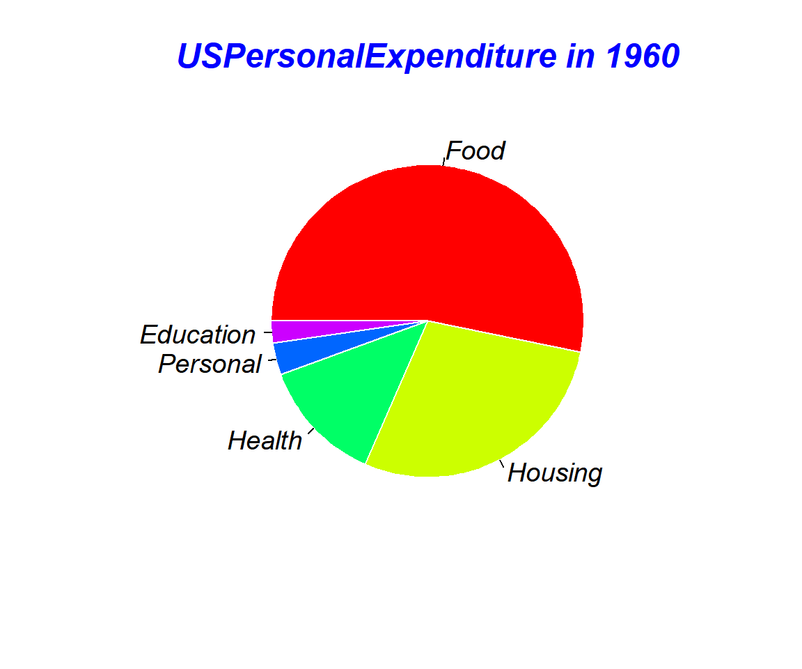
Pie Chart with Title, Labels, Colors, Fonts, Direction, Start Angle Set in R
The feedback form is a Google form but it does not collect any personal information.
Please click on the link below to go to the Google form.
Thank You!
Go to Feedback Form
Copyright © 2020 - 2026. All Rights Reserved by Stats Codes